Thursday 14 November 2013

ALL THAT GLITTERS

Whenever I teach a workshop I always say one can construct a tassel from any material and to prove my point here are some tassels made from various metals , mainly brass, but some painted iron or plated tin.

A brass drawer pull

More brass drawer pulls

Copper tassels

This tassel forms the base of a table

Painted iron tassels adorning a staircase

My favourite earrings, 1980's Butler and Wilson

Wednesday 16 October 2013

LONDON DESIGN FESTIVAL 2013

Jessica Light Trims and Tassels, having shown at The London Design Festival for the last five years, decided we deserved a well earned breather and this year became spectator rather than performer. So here is our meander through the shows and some of our personal highlights.
Leading the pack was Wrong For Hey. A design collaboration between Danish brand Hey and London designer Sebastian Wrong which resulted in a collection of furniture, textiles, lighting and accessories all showcased in an exquisitely restored Georgian town house in St James Park.


What I adored here was the juxtaposition of modernist aesthetics within a historical context and how well the two styles either bounced off or completely married with each other, so on occasion it was difficult to tell what was what, what?
There was a rational to this show- the evolution of design while recognising it's heritage. Those Georgians knew a thing or two about harmony of space and proportion. With their clean line of spatial symmetry, muted hues and quiet interiors [although they weren't adverse to the odd splash of decoration as seen in the Chinoiserie craze]it could be argued that they were the first to venture into minimalism [unless you wanted to be really pedantic and bring up the classical influence on 18th century design]. It could also be said that they invented the discipline of design as we know it today with this period seeing some of our greatest designers in action- Adam, Chippendale and Gibbs. So using this backdrop to show this new very contemporary collection seemed entirely natural but at the same time quite brave.
I sometimes feel that certain sections of the design community tend to want to compartmentalise everything - You do that so you belong over there and your style is this so you have to go there [snore]- and the never the twain shall meet- but it's the mixing of concepts, ideas and movements that can sometimes produce the most exciting visual experience, and this is what happened at Wrong For Hay.
Chomping at the bit were one of my favourite brands, Front. Having first come across their exquisitely made silk carpets at Decorex two years ago I was instantly smitten. Then they were showing muted Turkish inspired designs that were purposely worn and faded in places. A look I've since noticed elsewhere in rugs and wallpaper [could Front have instigated the new dip-dye?].
So what do you do when everyone starts jumping on your wagon of bands? You do what Front do and move on visually. Fronts new collection, based on Eastern European folk textiles were bold, bright and helped along with what looked like splashes of bleach or dye, but were actually part of the patterns.


Above, Front who showed both at Superbrands and Decorex

Tortus covetable ceramics

Frolicking in the paddocks was one of the main colour stories I noticed, a, dare I say dirty, mix of odd colours with a teeth squeaking acid yellow, grubby lavender,flat smoke blue and Germolene pink at it's core. These tones were very much in evidence in the beautiful fragile ceramics of Copenhagen company, Tortus, who were at Tent London and some of Farrow and Ball's new paint colours at Design Junction.

Below, Farrow and Ball's new paint colours.

More off colour schemes could be seen on the Wovenground, the one-stop rug source, stand at Design Junction. This company stocks another of my favourite textile brands, Gan Rugs.

Oddball colours on the Wovenground stand

Spanish company Gan Rugs, born in 1941, make not only rugs but co-ordinating modules. Giant knits, oversized unfinished cross-stitch and magnified plaits are used to create pattern and texture while creative use of colour combinations imbues mood and atmosphere. Their impressive roll call of designers include Patricia Urquiola.

Above and below, the wonderful Gan products.

In fine fettle were the new upholstery fabrics from Eleanor Prichard seen below.

Designed and sampled in Eleanor's Deptford studio and woven in Scotland on the Isle of Bute, these wool reversible geometrics, in a colour palate of neutral navy, grey and chalk with a dash of blood orange, are a wholly British affair [Hurrah!]
In the first instance these highly considered cloths will be probably be banded into the Mid-Century genre [more boxation], but they have much more depth and versatility than that. I was reminded of traditional timeless Scandinavian Rep weaves, a sturdy structure, that goes back centuries which resulted in tough textiles used for rugs, runners and seating. 
I think Prichard's new fabric designs have a timeless longevity, and would work well in many different stylistic settings and I believe Eleanor has plans for some exciting furniture collaborations.

Ceramic eyes at Squint

On a more quirky note were the carefully arranged clusters of surreal, almost cartoonesque, eyes from ceramic artist Myung Nam An at Squint, that observed you with wry humour and an anemone charm. I was also reigned into the artists interesting use of colour.

Daniel Heath, who showed at Tent London, produces detailed, delicate images inspired by nature that adorn bespoke printed wallpapers and material surfaces such as mirror and glass. I was particularly drawn to his etched reclaimed Welsh slate tiles that provoked an ethereal lyrical nostalgia -Dylan Thomas gently canters the country lanes with the Bauer brothers.

 
Daniel Heath's etched slate.

LeD's stand at Decorex was a weavers delight and it was fascinating to meet and talk to the designer behind this exciting textile company, Luc Durez.
Durez's weaves are sampled by him on his hand loom and then Jacquard woven in his native Belgium. Abstract, textual and some with such large repeats that they look like unique single panels, these shimmering weaves were all constructed out of man-made fibres woven into metal warps. 

An LeD weave


As stated at the beginning we didn't show this year but that wasn't entirely true and we trotted onto the Curiousa stand at Decorex.

As for next year? We'll be back with a new high-luxe thoroughbred collection of passementerie and a new [budget permitting] exciting product launch. What and where? Well keep an eye on our stable door.

Monday 2 September 2013

CLUB TO CATWALK

How do you make a lady of a certain age go all misty eyed with nostalgia about her youth? Take her to see 'Club To Catwalk' at the Victoria and Albert museum.
Take her back to a time when the North/South divide was about what side of the river you came from and reunite her with the excitement of tripping out into that severe 80's London night air that hit the back of your throat like a steel blade, in one's best homemade schmutter, to sample the decadent hedonistic delights offered up by a whole myriad of the eclectic, eccentric demimonde.
Remind her of when she was a bit of Wag girl, never having to queue, but would waltz right up to the front where Winston would wave her right through to ascend to that tiny first floor room in Wardour Street. Here all the boys, looking like Montgomery Clift or Harry Belafonte in their Bass Wejuns and red-tags with the red selvedge, eyed up girls with scarlet lips and giant hoop earings.It would get so packed on a Friday night that you could hardly move and she would stick her bottle of Pils down her cleavage for safe keeping and dance the night away to 'Baby Brother'
It was such a creative colourful atmosphere even though it was juxtaposed against the harshness of Thatcher's Britain, a real threat of impending Armageddon and the emergence of a new killer disease called AIDS [we really did think we were all going to die- and in the case of the latter a lot of the very talented tragically did]. 
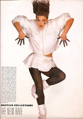
The early 80's were especially bright when it came to pattern and colours. Prints popped and fabrics stretched as Lycra was added to everything. Young British designers who had cut their teeth on Punk, rejected it's nihilism but kept the peacock strut, and a diverse group burst onto the catwalks as shown from this Vogue shoot from August 84.


Helen Robinson for PX


Liza Bruce

Katherine Hamnett


Katherine Hamnett

Annie Lepaz

Annie Sherburne

Body Map

Body Map

It's probably hard to understand the impact this had from our distance but you have to remember that Vogue, at this point, had turned into little more than an up-market Women's Own. Recipes and knitting patterns filled it's pages and the stylist, an enigmatic exotic creature, had only recently come into infancy, and hadn't yet evolved into the Dr Frankenstein of Fashion that she/he is today, so to see looks that you'd seen adorning London's nightlife fauna in a mainstream mag was quite something.


Above, 3 Jessica Light print designs circa 1984 which were mono-printed onto cotton jersey for a fashion show.


Above,
Our Antibes trims have a bit of an early 80's zingy vibe about them

DAVID BOWIE IS...
now over. One of the most successful exhibitions ever is now on a world tour so if it comes to a town near you don't miss.


If you were one of the thousands who made it to the V and A and now feeling a bit of Ziggy withdrawal why not add a bit of Aladdin Sane luxe glam to your home with our Potsdam trims as seen below


Sunday 18 August 2013

CREATIVE HOOK UP

So there you are having created the most amazing piece of design/craft/decorative art and the only person who knows it exists is you. How do you launch it to the big wide world? Well why don't you come along to Creative Hook Up on 1st September where I'll be speaking about how to market and PR a small creative business. Drawing on all my experience from devising and running Jessica Light Trims And Tassels I'll talk about how I go about getting attention for what I do from a wider audience other than the cat.


Creative Hook Up, the brainchild of Laura Austin, is a networking event with a difference and best described in her own words.

"Geared towards creative people not strictly “creative” by job title but also by nature, the Creative Hook Up event brings people together who have different expertise, skills, and ideas, and who could gain inspiration by talking to (and hearing from) like-minded (or un-like-minded) people from a myriad of backgrounds. A friendly place to make new connections, look for advice, gain insights, learn, feel inspired, energised and better connected with the world. "
For more information http://creativehookup.tumblr.com


Monday 22 July 2013

IN FINE STYLE


The above portrait of Princess Elizabeth, aged 13, by William Scrots, is one of my all time favourite paintings. I first saw it, in black and white, in a book about Queen Elizabeth 1 I was given when I was six. A pale face with a determined mouth showed not a child but someone whose young life had already witnessed so much [the execution of her mother for starters].It began a life-long fascination with all things Tudor. So to my great joy there seems to be an abundance of exhibitions about this period this year. First up was 'Treasures Of The Royal Courts' at The Victoria and Albert, now 'In Fine Style' at The Queen's Gallery, and later in the year 'Elizabeth 1 and Her People' at The National Portrait Gallery. I feel I've died and gone to Hampton Court.
'In Fine Style, The Art of Tudor and Stuart Fashion' demonstrates
in extraordinary detail through portraiture and rare examples of clothing from the period- a Stuart linen lace collar so delicate it would turn to air if handled, tiny ornate bodices that are slashed, padded, and quilted to elegant embroidered and trimmed kid gloves- the luxuriant decorative richness of the textiles, clothing and accessories that adorned the elite. This exhibition illustrates not only the extreme skill of the documenters, Holbein, Van Dyke, and Hilliard, but that of the weavers, embroiderers, seamstresses, and jewellers who produced these wares. The opulence of 16-17th century fashion wasn't just to cut a dashing figure but conveyed important messages about the wearers place in society.


Above, details of passementerie in some of the paintings on show at 'In Fine Style'

Those Tudors loved a bit of passementerie. It was everywhere, and anyone who was anyone would show their wealth and status by adorning not only their homes with it, but also their persons. A tassel was the Rolex of it's day. 
If I had set Jessica Light Trims and Tassels up in the 1500's instead of today I'd be snowed under with work. No urban croft but some fancy manor along the Thames where I'd be getting it on with Sir Francis Drake and ordering my minions about a la Steve Zissou [The Life Aquatic] "Hey you, intern! Get me a Campari!". Although I don't think they had Campari in the 16th century, or for that matter interns. So it would have been more along the lines of "Hey you serf! Get me a mead and be back by sundown or I shall behead thee!"
One can dream and the nearest I can get is to infuse my work with a touch of Tudor. The passementerie weaving techniques I was very lucky to be trained in [which differ greatly to other forms of weaving, both in a practical and technical sense] all hail from the 15/16th centuries, and I've always been drawn to the trim structures of this period.
When it came to our new diffusion range I pulled some of these influences out of my magician's hat along with an idiosyncratic melange of directions, materials and colours.

Harwick Diffusion range available from Jessica Light Shop from mid-August.

I will now come clean and admit I've always fancied donning a farthingale [it was on my 7th birthday list] although it would be rather cumbersome trying to get through the turnstiles at Hoxton station, but I'm often reminded of Tudor style in a diverse way from other fashion eras.
Whilst being surrounded by the hopelessly glamorous photographs of Erwin Blumenfeld at Somerset House recently I felt there was a touch of the Holbeins about some of the images. Haughty ladies gazed out at you from their regal poses in well tailored be-hatted outfits not too dissimilar to Hans' wonderful chalk drawings of Tudor nobility.


Above, 3 of Blumenfeld's lofty ladies.
Below, Their predecessors by Hans Holbein


You can even find a little of that early Elizabethan elegance in the 1970's [I kid thee not] in the delicious designs by British couturier John Bates as illustrated by the images below.


P.S. If you want to know what inspires Jessica's work see her post for the Horniman Museum blog about how their African Worlds gallery helped form her Bexley collection, and have a look at the range. http://www.horniman.ac.uk/get_involved/blog/horniman-inspiration-jessica-light http://jessicalight.blogspot.co.uk/p/bexley.html